Quality map previews
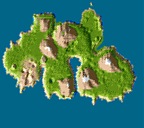
The Roman Campaign maps.

I have to say.

And I may be a little bold.
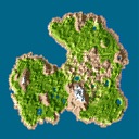
But these map previews.
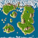
That automatically generate for the map upload service that I’m working on.
Just simply put.
Look better than anywhere else.
I spent quite a few hours getting it all right.
But now that I do generate them, and generate them properly.
I see no problem giving a little something to look at.
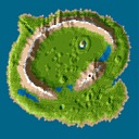
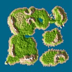
When generating these images I do use the game’s own palette. The difference comes from the details. Unlike any other tool that I’ve seen that generates these “thumbnails” of the maps, my new code actually takes each little texture into account. I also use a mixture of texture’s avarage color and the color game uses for repsenting the texture. Then I have some image manipulation magic adjusting the pixels just a little bit so that you don’t see that sawline you can see in the game’s map view. The coastline is just perfectly smooth, like is everything else. It is as if a full map screenshot was taken and then shrunk into viewable size. Just that you don’t see any forests around as I decided to leave them out.
I don’t know yet when I’m getting the service up and running. As this is a hobby project and I have all the time in the world, I want to spend the time to get the details right.
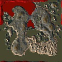
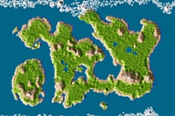
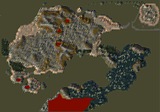
Here is a comparison shot showing Plateau of Dragons in both original 8-bit palette style and in the new system:
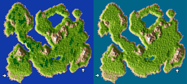
Coastline is the easiest difference to notice. It has antialias feel into it thanks to the processing of all surrounding textures of a point. The original map kind of only accounts for half of the data that is available. When putting all data together in the same space you’ll eventually lose something, but in the other hand get a smoother overall look as well.
